



Vegas, San Jose, Detroit, and Hamilton all revealed their new team names and dropped their logos for the 2027-28 season. The color combinations now make sense with the given names, and each franchise didn’t disappoint. Well, all but one. Detroit, San Jose, and Hamilton understood the assignment. A majority of PWHL fans were very optimistic to add four more expansion teams regardless of what the team names would be, and their reactions were positive with the outcome for the most part.
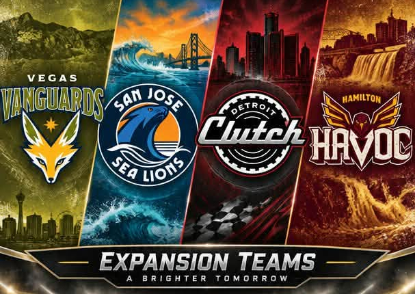
San Jose came in as the number one favorite due to their charmingly unique colors, although the name “Sea Lions” are a food source for sharks, which is also the name of San Jose’s NHL team. Coming in at number two is the Havoc, considering the vast amount of Peregrine Falcons that nest in Hamilton. Making its way to number three would be the Clutch, in Detroit, the “Motor City” which is a given having the auto industry theme with similar colors as the Red Wings. Last but not least, would be Vegas Vanguards. They missed the mark and most fans are still up in the air, or aren’t feeling the logo, name, or color combination at all. Also, pluralizing “Vanguards” leaves fans questioning the decision making, as well as the time and effort it took to finalize the name and logo. This one will have to grow on a lot of folks like the Vegas Golden Knights uni’s.
Either way it goes, the PWHL found their own identity with branding/name selection for each franchise. Some great, some not so much. But after the expansion teams inaugural season comes to a close, we will see the official threads with the team logos the following year, which could change how fans feel about the current color schemes, good or bad.
Dante Robinson | Senior PWHL Analyst for The NSR Network